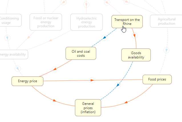
Drought and price increases: a concept map
An interactive graphic on the effects of drought: the relationships between climate crisis, energy crisis and inflation.

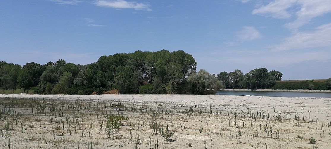
The Politico newspaper published last August an article on the severe drought that has occurred in Italy and most of Europe, and on its consequences on energy costs and price increases.
The article is very interesting for the amount of information it provides, but it is a challenge to understand due to the high multiplicity of aspects involved. It is difficult to grasp at the same time concepts of economy, climate, environment and agriculture which are variously connected to each other.
So I thought of a conceptual map which, reflecting the content of the article, would help give an overview and to orientate between its various facets and the possible points from which to start in the analysis of the problem.
How to read the map
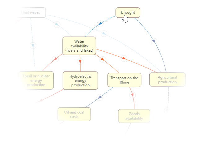
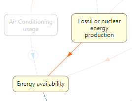
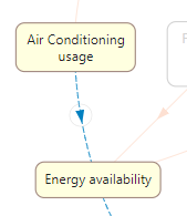
The map presented here is a graphic made up of squares (called "nodes") and lines that connect them to each other (called "arcs"). The nodes represent entities or phenomena that are in causal relationship (ie of "cause/effect" ) between them. A causal relationship from A to B, for example, indicates that A affects B, that is, a change in A ("cause") produces a change in B ("effect"). The relationship is represented by an arrow.
The effect can have a sign in agreement or discord with that of the cause. In other words, cause and effect can be positively correlated (they increase or decrease together) or negatively (if one increases, the other decreases, and vice versa).
A positive correlation will be represented by a continuous red arc (a warm bond, metaphorically : that is, an increase in the cause will heat up, increase, the effect).
A negative correlation, on the other hand, is represented by a dashed blue arc (a cold bond, again metaphorically: that is, an increase in the cause will cool, decrease the effect).
The map can be read from any point, but its structure has been designed so that the initial causes are at the top and the final effects are at the bottom, so that the causal "flow" descends from top to bottom along the different paths constituted by the lattice of arches.
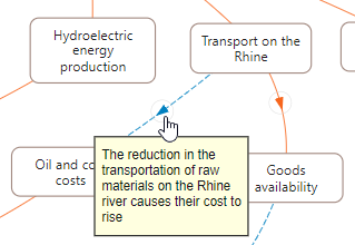
Pointing to the arrow of an arc will show an explanatory box of the particular phenomenon or reality underlying the corresponding relationship.
By pointing to the nodes, on the other hand, the subset of nodes that depend on the one chosen will be highlighted (that is, the nodes that can be reached by the chosen one, following the possible paths originating from its outgoing arcs).
Knowledge tools
As can be seen from the article cited and the map proposed here, to the various causes of inflation and the energy crisis we are experiencing (mainly the repercussions on supply chains caused by the exit from the pandemic and the war in Ukraine), must also be added the climate crisis. It seems to me a significant example of how we citizens, but the populations more generally, have to face problems related to our life that are very demanding to grasp in their complexity, much more than in any other past era.
Awareness of this difficulty and the consequent commitment required is essential if the general public is to participate in decisions and behaviors that are up to the problems of our time, in a democratic political framework.
In this perspective, tools like this one proposed here, concept maps, can be of help not only in informing, but also in increasing the knowledge on the nature of complex phenomena and therefore in making people more autonomous in knowing how to move with confidence in today's intricate and often polluted world of communication.
These tools have been used for some time, especially in schools and social sciences, and therefore are not new. However, they are most often used as static graphic objects, suitable for printing on paper. What we are trying to do here is attribute to the conceptual map the capabilities of interactivity and dynamism, typical of the IT tool, capable of stimulating the processes of reasoning, memorization and learning.
Regarding the terminology, concept maps like this one presented here are often called, in the scientific field, more properly, cognitive or causal maps, which are more appropriate expressions if the arcs represent causal relationships and if their structure is not strictly hierarchical. However, I chose to use the term "conceptual" anyway because, although it is more generic, I think it is easier to understand. In any case, in mathematics a graphic object with nodes and arcs as just described is called an oriented graph.
Notes and warnings
The repercussions of drought on ecosystems are also explained in the cited article. However, they have not been included in the map for simplicity.
A conceptual map like the one presented here is still, albeit with interactivity characteristics, a static representation of a phenomenon: it is useful to indicate the logical links between its various aspects, but it is not able to show its temporal evolution. It also does not provide an indication of the different intensities of its elements and therefore of their weight, which makes all the various elements equally important. However, given the flexibility of the IT tool, it is also possible to add more sophisticated features that represent the temporal evolution of the phenomenon examined.
The map, obviously, constitutes a model of the reality of interest and therefore reflects the personal opinions and intentions of the author.
Despite its limitations, however, a representation like this can be useful as a visual summary, a concise, albeit simplified, visualization of complex realities.
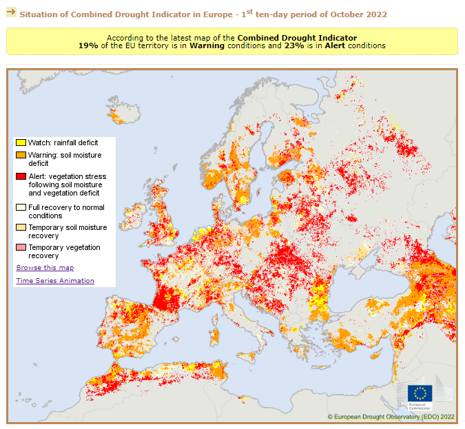
Updates on drought
Unfortunately, the drought in Europe is still ongoing, even in late autumn. Updated information can be found on the website of EDO, a European body dedicated to the topic. Below is the situation in the first ten days of October 2022.
Regarding energy prices, the fact that, in addition to drought, there was a period of exceptionally mild temperatures in most of Europe up to November, ultimately greatly reduced the consumption of gas for heating by lowering considerably its price. This aspect could also find its place in the concept map but this is, as they say, another story.
References
-
Article on "Politico":
https://www.politico.eu/article/starving-hedgehogs-dry-rivers-parched-farms-the-toll-of-europes-worsening-drought/ -
EDO (European Drought Observatory), European drought observation body:
https://edo.jrc.ec.europa.eu/edov2/php/index.php?id=1000
-
"Concept Map" on Wikipedia:
https://en.wikipedia.org/wiki/Concept_map -
"Cmap", a tool for creating concept maps:
https://cmap.ihmc.us/docs/learn.php - History and introduction to the Fuzzy Cognitive Maps in Bart Kosko, "Fuzzy Thinking", chapter XI.
-
"Fuzzy cognitive map" on Wikipedia:
https://en.m.wikipedia.org/wiki/Fuzzy_cognitive_map
- The above concept map was created with a program written by me in JavaScript, and uses the features of the well-known software package D3.js (https://d3js.org/).
- For the styles and the graphical representation of the nodes, the solution "d3-mind-map", still written in JavaScript, was helpful. (https://github.com/kdashivantha/d3-mind-map)
- The map operation has been tested on the latest versions of Chrome, Edge and Firefox browsers. Viewing on a large screen is recommended.
- Please report any malfunctions to: andrea@alberini.com
Andrea Alberini, 12 November 2022
Comments powered by Talkyard.